Accepted File Types
Preparing your artwork correctly before sending it for print is one of the most important steps in achieving a professional result. Different printing processes require files to be supplied in certain formats so that colours, images, and text reproduce accurately. Supplying artwork in the correct file type helps avoid delays, prevents unexpected results in the final print, and ensures your job can move smoothly into production.
For both large format digital printing and lithographic (litho) printing, we recommend supplying artwork as high-resolution, print-ready PDF files whenever possible. A properly prepared PDF is the most reliable file format because it can safely contain images, text, vector graphics, and fonts all within a single document. When exported correctly, a print-ready PDF preserves the layout of your design exactly as intended and reduces the risk of missing fonts or unexpected formatting changes.
For large format printing, we also commonly accept TIFF and EPS files. High-resolution TIFF files are ideal for image-heavy designs such as posters, exhibition graphics, and photographic prints because they support high image quality without heavy compression. EPS files, on the other hand, are vector-based and are particularly useful for artwork containing logos, line graphics, or illustrations. Vector graphics are mathematically defined rather than made from pixels, which means they can be scaled up to very large sizes without losing quality — a key advantage when printing banners, signage, or large displays.
Litho printing typically works best with print-ready PDF files, as these files integrate seamlessly with professional pre-press workflows used to create printing plates. When prepared correctly, a PDF will contain embedded fonts, properly converted colours, and images at the correct resolution, helping ensure the printed result matches the intended design.
When preparing images for print, it is important that they are supplied at a true resolution of 300 dpi (dots per inch)at the final print size. Resolution refers to the amount of image detail contained within a file. Images that are 300 dpi at the correct size will appear sharp and clear when printed. Increasing the resolution of a low-quality image by simply “up-rez’ing” or enlarging it does not actually add new detail — it only spreads the existing pixels further apart, which can result in blurry or pixelated prints. For the best results, always start with high-resolution source images.
Artwork should also be prepared in the CMYK colour format, which is the colour model used by professional printing presses. CMYK stands for Cyan, Magenta, Yellow, and Black, the four inks used during the printing process.
Files supplied in RGB colour mode (which is commonly used for screens and digital devices) can produce unexpected colour shifts when converted for printing. By preparing artwork in CMYK from the start, you have much greater control over how colours will appear in the final printed piece.
There are also several file types that we recommend avoiding when supplying artwork for professional printing. Low-resolution JPEG files are a common issue, particularly when images have been downloaded from websites or copied from social media. These files are usually heavily compressed and may only be suitable for screen display rather than high-quality printing. Similarly, PNG files are designed primarily for digital use and web graphics. While they work well online, they are often supplied at lower resolutions and do not always translate well into professional print workflows.
Using low-quality image formats can result in prints that appear blurry, pixelated, or lacking in detail, particularly on larger prints where image quality becomes even more noticeable. To achieve the best possible results, always supply artwork in high-resolution, print-ready formats such as PDF, TIFF, or EPS, prepared with the correct colour settings and resolution from the beginning.
Taking the time to prepare your files correctly helps ensure your finished prints look sharp, vibrant, and professional.
Colour Format
Correct colour setup is essential when preparing artwork for professional printing. To achieve accurate and consistent results, all artwork supplied for both large format digital printing and lithographic (litho) printing must be created in the CMYK colour format.
CMYK stands for Cyan, Magenta, Yellow, and Black, which are the four ink colours used by commercial printing presses. During the printing process, these inks are layered in tiny dots to reproduce a wide range of colours on paper or other materials. Because printing relies on these four inks, all colours within your artwork must be defined using CMYK values so that the printing equipment can reproduce them correctly.
Many digital design tools and cameras create artwork using the RGB colour model, which stands for Red, Green, and Blue. RGB is designed for screens such as computers, tablets, and smartphones where colours are produced using light rather than ink. RGB can display a wider range of bright colours than print processes can reproduce, which means artwork designed in RGB may appear much more vibrant on screen than it will when printed.
If RGB colours are supplied in a print file, they must be converted to CMYK before printing. During this conversion process some colours — particularly bright greens, blues, and oranges — may change significantly. This can result in printed colours looking duller or different from what was originally expected. For this reason, we require all artwork to be fully converted to CMYK before it is supplied for print, ensuring you have full control over how the colours will appear in the final result.
Checking your colour settings early in the design stage can help avoid problems later. Most professional design software allows you to set the document colour mode to CMYK from the beginning, which ensures that all colours added to the design are created using print-ready values.
There are some specific promotional print items where colour preparation is slightly different. For specific products such as branded pens, notebooks, and similar promotional merchandise, printing is often carried out using spot colours rather than the standard CMYK process.
In these cases we require artwork to use a single, 100% strength PANTONE colour. The PANTONE Matching System (PMS) is an internationally recognised colour system used in printing to ensure precise colour consistency. Each PANTONE colour has a unique reference number, allowing printers to match ink colours accurately across different print runs and materials.
When preparing artwork for these promotional products, the colour should be supplied as a 100% Coated PANTONE reference rather than as CMYK or RGB values. This ensures that the printing equipment uses the exact ink colour specified rather than attempting to simulate the colour using multiple inks.
For example, instead of supplying a colour defined as a CMYK mix such as C:100 M:70 Y:0 K:20, the artwork should specify a PANTONE reference such as PANTONE 286 C at 100% strength. Using the correct PANTONE reference helps guarantee that the printed result matches the intended brand colour as closely as possible.
Using the correct colour format from the beginning of the design process helps avoid unexpected colour changes and ensures your printed materials look consistent, professional, and true to your brand.
Image Resolution
Image resolution plays a major role in determining how sharp and professional your printed materials will look. Resolution refers to the amount of detail contained within an image and is typically measured in dpi (dots per inch). The higher the resolution, the more detail the image contains and the better it will reproduce when printed.
For most professional print work, including both litho printing and large format printing, images should be supplied at 300 dpi at the final print size. This ensures photographs, graphics, and illustrations appear clear, sharp, and detailed when printed.
A common misunderstanding is that image resolution can simply be increased within design software. While it is technically possible to change the number in the resolution settings, this does not actually improve the quality of the image. Increasing the resolution of a low-quality image simply spreads the existing pixels across a larger area, which can result in a soft, blurry, or pixelated appearance when printed.
For example, an image taken from a website or social media platform may look perfectly fine on screen, but these images are often only 72 dpi, which is suitable for digital display but not for high-quality printing. When printed at larger sizes, low-resolution images quickly lose detail and can appear blocky or fuzzy.
To achieve the best results, always start with the highest quality images available, ideally original photographs or professionally supplied graphics. If you are unsure whether an image is suitable for printing, it is always best to check the resolution before placing it into your artwork.
For very large format prints such as banners or exhibition graphics, the required resolution may sometimes be slightly lower due to the typical viewing distance. However, starting with the highest resolution images available will always produce the best overall print quality.
Trim, Bleed & Safe Areas
When we Trim printed items to their final size, the cutting process must be extremely precise. However, even with modern printing equipment there can be very small variations in where the cut occurs. To ensure that your design prints correctly all the way to the edge of the page, artwork must include what is known as bleed.
Bleed is the extra area of artwork that extends beyond the final trimmed size of the document. This ensures that when the printed sheets are cut down to size, there are no unwanted white edges around the design.
For most printed materials, we recommend setting up 3mm bleed on all sides of the document (see specific product artwork notes). This means that background colours, images, or design elements that reach the edge of the page should extend 3mm beyond the final trim size. For example, if you are creating an A4 document measuring 210mm × 297mm, the artwork file will be 216mm × 303mm, which allows for the extra bleed around all sides.
In addition to bleed, some products also require what is known as a Safe Area. The safe area is an inner margin within the page where important content such as text, logos, and key graphics should be positioned. Keeping important elements inside this area ensures they will not be affected by the trimming process.
As a general guideline, important content should be placed a few millimeters inside the trim edge (see specific product artwork notes). This helps prevent any critical information from being accidentally trimmed or appearing too close to the edge of the finished print.
Including proper bleed and safe areas ensures your printed materials have clean edges, balanced layouts, and a professional finish.
Fonts and Outlining Text
Text plays an important role in many printed designs, but fonts can sometimes cause issues if they are not supplied correctly with your artwork.
When a design uses a particular font, that font must be available to the system processing the print file. If the font is missing or unavailable, the software may automatically substitute it with another font. This can cause unexpected layout changes, spacing issues, or incorrect formatting.
To prevent these problems, we recommend converting all text to outlines (also known as curves) before supplying your final artwork. When text is outlined, it is converted from editable text into vector shapes. This means the text will appear exactly as designed, regardless of whether the original font file is available.
Outlining text ensures that your typography remains consistent and accurate, with no risk of font substitution during printing.
If you are supplying a print-ready PDF, it is also important to make sure that all fonts are fully embedded within the file. Most professional design software includes this option when exporting PDFs for print.
Taking a moment to outline text or embed fonts can prevent common artwork issues and helps ensure the final printed result matches your original design.
Large Format Scaling (1:10 Artwork Setup)
Large format printing is often used for items such as banners, exhibition displays, posters, and signage. Because these designs can be very large, creating artwork at the full physical size can sometimes produce extremely large file sizes that are difficult to work with.
To make artwork preparation easier, large format designs are often created at a scaled size, typically 1:10 of the final print size. For example, if the finished banner size is 3000mm wide, the artwork can be supplied at 300mm wide when using a 1:10 scale. The printing software will then scale the artwork back up to the correct size during production.
When working to a scale, it is important that all elements are scaled consistently, including images, text, and bleed. Resolution should also be adjusted accordingly.
For example, if the artwork is supplied at 1:10 scale, images should ideally be at least 300 dpi at the scaled size, which will translate correctly when enlarged to the final dimensions.
Scaling artwork in this way helps keep file sizes manageable while still ensuring excellent print quality. If you are unsure whether your artwork should be supplied at full size or scaled down, it is always best to check before preparing the file.
Supplying Print-Ready PDFs
A print-ready PDF is the preferred file format for most professional printing processes because it preserves the exact layout of your design and includes all the necessary elements required for printing.
When exporting a PDF for print, it is important to ensure several key settings are correct. Images should remain at high resolution (300 dpi), colours should be set to CMYK, and any required bleed settings should be included.
Fonts should either be embedded within the PDF or converted to outlines, ensuring the text displays correctly during printing.
Most professional design programs include preset export options such as “Press Quality” or “PDF/X-1a”, which are designed specifically for print production and generally provide reliable results.
Before sending your artwork, it is always a good idea to review the exported PDF carefully. Check that images appear sharp, colours look correct, and no elements are missing or misaligned.
Supplying a properly prepared print-ready PDF helps prevent delays and ensures your job can move smoothly into production.
File Size Limits & How to Send Your Files
To ensure artwork files can be processed quickly and efficiently, we ask that all files supplied for printing are no larger than 1GB per file. Files larger than this can sometimes be difficult to upload, download, or process during the pre-press stage, which may slow down production.
For smaller artwork files, you may be able to attach them directly to an email in this case you MUST use your order numbers from your email confirmation.
However, most high-quality print files are quite large, especially when they contain high-resolution images. In these cases, we recommend sending your artwork using a file transfer service such as WeTransfer.
WeTransfer is a free and simple way to send large files securely over the internet. It does not require you to create an account and is widely used for sending artwork files within the design and print industry.
To send files using WeTransfer:
• Go to www.wetransfer.com in your web browser.
• Choose the option to send files via email.
• Upload your artwork files from your computer.
• Enter our email address: ask@shell-scheme-essentials.co.uk
• Enter your own email address so the system can confirm the transfer back to you.
• Add your order number from the email you received from us into the subject line and add a short message about your files and best to add the order number again as a double check, then send the files – it is important wait until the send process has completed.
Once the files have been uploaded, WeTransfer will notify us automatically so we can download your artwork and begin checking it for print.
If your project includes multiple products or files, it is really helpful to organise them clearly and include the order number and product name as their file name(s) so we can attribute them to your products and your order. This helps our team identify your artwork quickly and reduces the risk of confusion.
If you are unsure whether your files are suitable for sending, our team will always be happy to advise before you upload them.
How to Check Image Resolution Quickly
Checking the resolution of images before placing them into your artwork is one of the easiest ways to avoid poor print quality.
As a general rule, images used for printing should be 300 dpi (dots per inch) at the final print size. This ensures photographs and graphics appear sharp and detailed when printed.
There are a few quick ways to check the resolution of an image…
(1) View the image properties on your computer. On most systems, you can right-click on the image file, select Properties (or Get Info on a Mac), and look for the resolution information in the image details.
(2) If you are using design software such as Adobe Photoshop, Illustrator, or InDesign,
the resolution can usually be checked directly within the program. Photoshop will display the image resolution within the Image Size settings, while InDesign and Illustrator can show the effective resolution of placed images within their links or document information panels.
(3) Another useful tip is to always check the resolution at the size the image will appear in the final design. For example, if you enlarge a small image to fill a large space on the page, the resolution will decrease and may fall below the recommended level.
(4) Images taken from websites, screenshots, or social media are very often only 72 dpi, which is suitable for screens but not for high-quality printing. Using these images will very probably result in blurry or pixelated prints.
(5) Whenever possible, always use original, high-quality CMYK images from the source file or from a professional image library.
How to Export Print-Ready PDFs from Illustrator, InDesign, and Photoshop
Most professional printing workflows work best with print-ready PDF files. Exporting a PDF correctly helps ensure your artwork prints exactly as intended. Although the process may vary slightly between design programs, the overall approach is very similar.
Exporting from Adobe Illustrator
When exporting a PDF from Illustrator:
• Select File; > Save As.
• Choose Adobe PDF; as the file format.
• Select a print preset; such as Press Quality or PDF/X-1a.
• Ensure bleed settings are included; if your artwork requires bleed.
• Check that colours are set to CMYK; and that fonts are embedded or outlined.
• Save the file.
These settings help ensure that images remain high resolution and that the document prints correctly.
Exporting from Adobe InDesign
InDesign is widely used for print layout and includes very reliable PDF export tools.
When exporting a PDF from InDesign:
• Select File; > Export.
• Choose Adobe PDF (Print); as the format.
• Select a preset; Press Quality or PDF/X-1a.
• Under the Marks and Bleeds section; enable Use Document Bleed Settings; if your document includes bleed.
• Export the PDF.
This will create a print-ready file suitable for professional printing.
Exporting from Adobe Photoshop
Photoshop is often used when artwork consists mainly of images. Ensure the document is in CMYK colour mode and the resolution is 300 dpi.
When exporting a PDF from Photoshop:
• Select File; > Save As or Save a Copy.
• Choose Photoshop PDF; as the format.
• Select a High Quality Print preset.
• Save the file.
Before exporting, it is always a good idea to review your artwork and make sure all images appear sharp and correctly positioned.
Artwork Checklist Before Sending Files
Before sending your artwork for printing, it is helpful to quickly review the file to ensure everything has been prepared correctly. A simple check can prevent delays and help achieve the best possible print results.
Here is a quick checklist to follow:
File Format – make sure the artwork is supplied as a print-ready PDF, TIFF, or EPS file, depending on the artwork notes specified for your project.
Colour Format – confirm that all colours are set to CMYK rather than RGB. If the job requires a PANTONE spot colour (pens and notebooks only), check that the correct reference has been used.
Image Resolution – ensure all images are 300 dpi at the final print size so that they will print clearly.
Bleed and Margins – check that 3mm bleed has been added to all sides if the design runs to the edge of the page. Important text and logos should be placed slightly inside the edge to avoid trimming issues.
Fonts – make sure all fonts are outlined and that the text displays correctly, this means fonts are not required eliminating one of the most common errors.
File Size – confirm that the file size is under 1GB so that it can be uploaded successfully.
Spell Check – make sure you’re happy with the grammar, punctuation and ensure you have run a full spell check before supply your artwork file(s) to ensure there are no costly reprint costs.
Final File Review – open the exported file(s) and check the artwork visually. Make sure images appear sharp, colours look correct, and nothing is missing or misaligned within the layout. Taking a few minutes to complete this basic checklist, before submitting your files, helps ensure your artwork is ready for print and reduces the chance of any issues during production, causing costly reprints.
8 Common Artwork Mistakes to Avoid
- Low-Resolution Images and Pixelation: This is the most common error. Artwork often uses 72 DPI images (standard for web / screen viewing only), instead of the required 300 DPI resolution required for print. Lower quality images cause images to look blurry or pixelated when enlarged.
- Designing in RGB instead of CMYK: Content on screens use RGB colour format, while large format printers and litho print use the CMYK colour format. Supplying files with RGB colours can cause vibrant screen colours to appear muted, dull, or shift completely when printed via large format and litho print processes.
- Ignoring Bleed and Safe Zones: Large format prints require a 3mm to 5mm “bleed” area beyond the trim line to prevent white edges (check your specific products artwork notes at the base of it’s page). Neglecting this, and failing to keep text/logos within the “safe zone” (again specified on relevant product pages) could result in important content being cut off.
- Using Raster Images Instead of Vectors: Logos and text should be Vector graphics (.AI file formats, .EPS file formats or PDF file formats). Using raster formats such as JPG and PNG for text and images causes them to become blurry if enlarged to large scales.
- Improper File Dimensions and Scaling: Artworking at the wrong size (e.g., using a small A4 canvas for a 10-foot wide banner) leads to distortion when scaled up and to elements being cropped off, if the print file is not in direct proportion to the final finish size. It is best to design at either 100% scale (1:1 ratio), 50% scale (1:2 ratio), 25% scale (1:4 ratio) or at 10% scale (1:10 ratio), depending on the printer’s requirements and the type content within the master file.
- Non-Outlined Fonts: If fonts are not converted to outlines (curves), we may not have the exact font you used. Asking us to substitute your font with ours is likely to cause text to reorder itself which risks text not viewing and being missed off. Therefore we request all text is converted to outlines (curves) so this is never an issue.
- Overcrowded and Illegible Text: Large prints are often viewed from a distance, if you cram too much information into the space or it is too big. This makes the design hard to read and visually overwhelming for your intended audience.
- Spelling, Punctuation and Grammatical Errors: Please ensure your master artwork has been spell checked thoroughly to ensure there are not sill errors. Check that the correct punctuation and grammar have been used so the item is clear, easy to read and understandable for your audience.
By checking your artwork carefully before submission and following the recommended guidelines, helsp ensure your printed materials look sharp, professional and as intended.
some popular products…

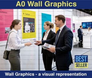

Wall Graphics
Graphics and posters are one of the most cost effective and easiest ways to brand your plain white shell scheme walls. We offer flexible posters and rigid graphics in A0, A1 and A2 sizes.
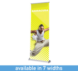
Roller Banners
Banner stands are one of the most popular forms of branding and advertising, they offer easy transportation, easy install and offer a range of sizes to help brand your shell scheme space.
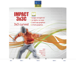
Popup Stands
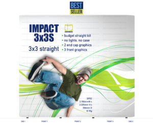
Popup stands are recognised as the best way to deliver branded messages at trade shows, they provide high impact walling displays and can be linked together to form larger displays
Counters
We offer a wide range of promotional display counters spanning all budgets, from simple popup style systems to more durable, table top demo options – all brand able for added impact.
Stand Branding Service
Our stand Branding Service offers continuity when attending multiple events across the year. Hire the graphic walls needed and we’ll install them for you and include a branded counter (England only).
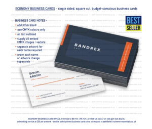
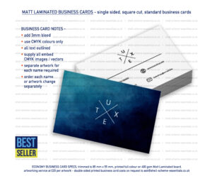
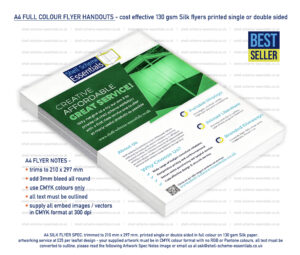
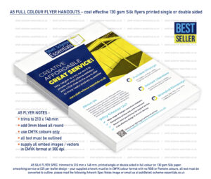
Printed Items
We know you’ll need support with printed literature and branded giveaways so we offer a range of business cards, leaflets and promotional goods to help elevate your trade show attendance.